Julian Waters
Gaithersburg, MD
B36 — The Mystery & Magic of Hybrids
Four-Day Class, Monday, July 27 – Friday, July 31
Intermediate/Advanced
Lettering
We will first review fundamentals and warm up with some broad edged pen writing with traditional bookhands, caps, italic etc., firming up our proportions, spacing and consistency, and learning refinements and technical tricks along the way. Once fortified, we can then apply these principles to any broad edged pen style to follow. We can then launch into our style variations through exercises in texture, word shapes and en masse writing, in both subtle and extreme new style flavors.
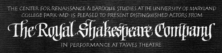
We can find many interesting hybrids throughout history, like the writing between the late Carolingian and early gothic, or when late renaissance italic started to be made with more flexible tools by Cresci and others. 16th-17th century writing masters from Johann Neudörffer to Esther Inglis expanded their calligraphic range of their styles to include more and more amazing hybrid styles, mirror writing, extreme forward and back slanted styles, outline forms, etc., to show off their virtuosity.
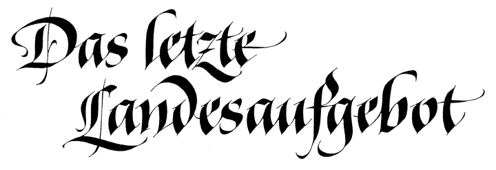
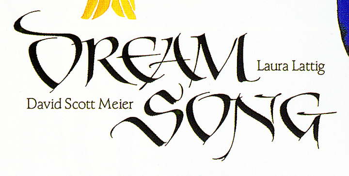
Closer to our time, inspiring creative individuality came from the genius of European master calligraphers such as Schneidler, Trump, Zapf, Brudi, Neugebauer, Poppl, Korger, and others who created fresh new styles, making their lettering, type designs, bookjackets, and logos more distinctive than the next designer’s. Their lettering and calligraphic typefaces can teach us a lot and and give us a springboard into many new directions along with our own experiments.
Julian will produce a handsome spiral coil-bound resource book for each student, a collection of inspiration and instruction which you will want to keep for years after the class.
Supply List
- Basic calligraphy supplies plus:
- Large Speedball dip nibs (C0, C1, C2), and smaller Mitchell, Brause, etc. dip nibs you like
- Penholders, and reservoirs if you bring Mitchell nibs
- Large poster pens (1/2″ – 3/4″) such as Coit, Automatic, Horizon
- 1/2″ Winsor & Newton series 995 flat brush
- Good, non-waterproof black ink which does not bleed
- Gouache
- Optional: Stick ink and grinding stone
- All paper should be at least 14″ x 17″; be sure to test the paper for bleeding.
- Smooth layout paper such as Borden & Riley Boris marker, plus any of your favorite, more textured or hand-made papers for more finished work.
- This is a lettering workshop and color is not required. However, please bring color if you want to work in color. Check paper for bleeding.
- It is hard to get the right ink flow when writing flat, so a lap board or portable desk would be great
 Son of calligrapher Sheila Waters and book conservator Peter Waters, Julian Waters studied extensively with legendary calligrapher/type designer Hermann Zapf, who chose Julian to succeed him at the Rochester Institute of Technology in the late 1980s. Julian’s clients include U.S. Postal Service, National Geographic, many agencies, and memorials. His typefaces include Adobe Waters Titling Pro family and ThJefferson for Jefferson’s Monticello. In the 1990s Waters taught typography at Corcoran School of Art, in Washington, DC. In 2001, he was invited to be part of the Zapfest exhibition in San Francisco. Waters has lectured and taught workshops for calligraphers worldwide and has taught several times at Cooper Union, NY, and Wells College Book Arts Institute, NY.